Page 2 of 5
Re: Tridentkilla's shop
Posted: Wed Mar 04, 2009 8:07 pm
by feeNicks
i would suggests instead of just taking stock renders and not doing anything to them, duplicate them onto new layers and maybe try to make them blend into the background, erase some stuff that doesn't look good ect.
Re: Tridentkilla's shop
Posted: Wed Mar 04, 2009 8:10 pm
by Tridentkilla
I've been experimenting with it, but Gimp isn't cooperating with my attempts.
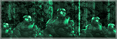
Re: Tridentkilla's shop
Posted: Fri Mar 06, 2009 3:44 pm
by Tridentkilla
Another new one, i tried some other things, I couldn't fade it or some of the render's detail would have been lost.
Re: Tridentkilla's shop
Posted: Sat Mar 07, 2009 8:42 am
by Tridentkilla
I put a fractal brush over it, and erased the area that covered the sig... i need to get a brush of some form that lets me do an effect out from the render.
Re: Tridentkilla's shop
Posted: Sun Mar 08, 2009 3:58 am
by Nightmare
Tridentkilla wrote:I put a fractal brush over it, and erased the area that covered the sig... i need to get a brush of some form that lets me do an effect out from the render.
You won't find a brush that does an effect out from the render, cos every render is different. You need to blend/smudge, and then and rub out parts when you brush yourself.
Or you can use stock images, instead of renders, to make the focal blend better with the background
Re: Tridentkilla's shop
Posted: Sun Mar 08, 2009 6:30 am
by Tridentkilla
Thanks for the tip... The homework i've been avoiding is catching up to me, so i'll give it a shot when i have a spare moment. Thank you for the comments, much better than my first attempt though eh?

Re: Tridentkilla's shop
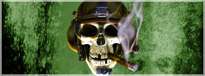
Posted: Sun Mar 08, 2009 7:53 pm
by Tridentkilla
this one is a request.
Re: Tridentkilla's shop
Posted: Mon Mar 09, 2009 7:51 am
by minisaiyan
i reccomend facing the focal into the center of the sig, it makes it look more appealing imo
Re: Tridentkilla's shop
Posted: Mon Mar 09, 2009 1:51 pm
by Tridentkilla
well the stock image i was working from kinda cut off at that edge...
Re: Tridentkilla's shop
Posted: Sat Mar 14, 2009 7:11 am
by Tridentkilla
Bump, I do take requests.
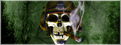
Re: Tridentkilla's shop
Posted: Sat Mar 14, 2009 1:28 pm
by Tridentkilla
new one...

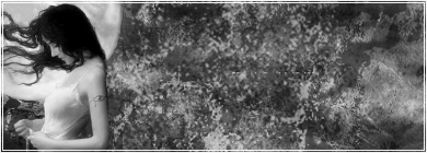
Re: Tridentkilla's shop
Posted: Sun Mar 15, 2009 8:03 pm
by Tridentkilla
New
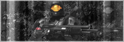
Re: Tridentkilla's shop
Posted: Thu Mar 19, 2009 9:22 am
by Tridentkilla
Bump, there is a comment on prices in the first post.
Re: Tridentkilla's shop
Posted: Thu Mar 19, 2009 6:31 pm
by murkar
Good first sigs

The only thing, I would say, is that your colors are too uniform. Instead of having a red sig or a green sig, have a color scheme that includes about three main colours.
You can do that with a gradient map. I've written a short tutorial which describes an easy technique for colour blending and matching. If you haven't used a gradient map before then this should help you:
[spoiler]When you've got a sig like those ones completed, save a copy and then merge all of yoru layers into one (you don't have to do this if you don't want to, just put the color adjustment layers on top of everything).
On top of your sig add a black to white gradient map. You can add a gradient map by clicking that black/white circular button near the bottom of the layers panel and select "Gradient Map" (not just gradient, but gradient map). When you've got that open then make sure the gradient is black to white (black on the left of the gradient preview image and white on the right, not the reverse). You can change the type of gradient map by clicking the arrow to the right of the preview image which will open a drop down menu of gradient maps to choose from - click the one you want. What this will do is give you a very good black and white image, much better than just reducing the saturaion to zero.
When you've done that reduce that gradient map layer's opacity to perhaps 65%. Add another gradient map, but this time choose on that's colored. I used orange and purple, which is one of the default gradient maps on photoshop CS2. In the top left corner of the layers menu there is a drop down menu - this is the blending mode. With the colour gradient map selected, change the blending mode to soft light.
This is my result using one of your sigs:

Original:
You will need to use different gradient maps in different situations, but play around with it and it should improve your color schemes overall. I hope that helped, if not then let me know and I will remove the info from this post.[/spoiler]
Re: Tridentkilla's shop
Posted: Fri Mar 20, 2009 8:04 pm
by Tridentkilla
Thanks murkar, but right now, Sig Duty has been put on hold due to computer crash... I may need to replace it, but idk how bad it is yet...
I will return to the Sig Shop arena soon.