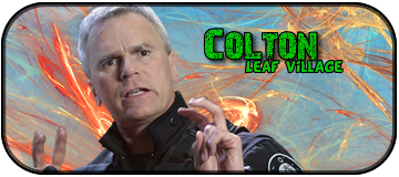
Colton wrote::lol:
I don't think I'll post an attempt for this one since I'm VERY new to making sigs and the last time I posted one of mine up against some of 'The Greats'.. Mine actually got picked, and I felt like an ass lol
DO IT.
Moderator: Market Mods
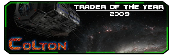
Colton wrote::lol:
I don't think I'll post an attempt for this one since I'm VERY new to making sigs and the last time I posted one of mine up against some of 'The Greats'.. Mine actually got picked, and I felt like an ass lol


Universe wrote:Because you're a good guy, and fun to work with, I figured I'd try too.
Edit: >_< Lots of minor details errors, I can fix when I am home.
gigs wrote:Made some more
Please Give Feedback


murkar wrote:Your problem, SuperSaiyan, is that your sig is too large. The other problem is that you're using photobucket, which automatically reduces image size. I guarantee that if you upload the sig here (just in case it doesn't occur to you, I thought I'd better tell you to click this link) instead of using photobucket your sig will look fine. If I'm wrong then give me your ID and I'll send you 100Bil and 50k UU.
[spoiler]When I gave you my take on the issue, I assumed you were using photoshop correctly. If my diagnosis is wrong, though, then you've shrunk the render or sig without constraining the proportions first. In other words, the assumption at the beginning of this paragraph is wrong. When you shrink images you need to make sure that the percentage you are shrinking the length and width by are identical - length and width percentages are near the top when you're in photoshop in case you didn't know. Check the box beside the length and width, which should say "constrain proportions", to do this automatically. Reinsert the render and constrain the proportions when you shrink it.[/spoiler]
Semper wrote:murkar wrote:Your problem, SuperSaiyan, is that your sig is too large. The other problem is that you're using photobucket, which automatically reduces image size. I guarantee that if you upload the sig here (just in case it doesn't occur to you, I thought I'd better tell you to click this link) instead of using photobucket your sig will look fine. If I'm wrong then give me your ID and I'll send you 100Bil and 50k UU.
[spoiler]When I gave you my take on the issue, I assumed you were using photoshop correctly. If my diagnosis is wrong, though, then you've shrunk the render or sig without constraining the proportions first. In other words, the assumption at the beginning of this paragraph is wrong. When you shrink images you need to make sure that the percentage you are shrinking the length and width by are identical - length and width percentages are near the top when you're in photoshop in case you didn't know. Check the box beside the length and width, which should say "constrain proportions", to do this automatically. Reinsert the render and constrain the proportions when you shrink it.[/spoiler]
It wont be photobucket. I have used Photobucket for years with my signatures and they have come out fine. I originally used Pizco! lmao...
Noobert wrote:SuperSaiyan wrote:really?
what exactly on there is blurry?
cause I didn't add any effects to the spartan render
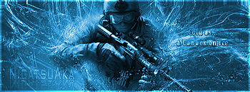
I don't know, it just looks a bit blurry. Maybe I'm insane, I don't know. Nigatsu_Aka wrote:I couldn`t find any ideea how to include the halo3 clip in a signature without ruining it. So i abandoned that ideea and choosed a "warrior" theme.
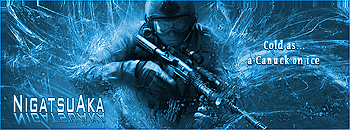
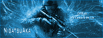
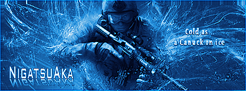
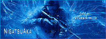
Tell me if you like this sample and/or what would you like to change:
Now that one I like, just the names would need to stand out more and I'd probably pick it. I like the phrase too!

Noobert wrote:Universe wrote:Because you're a good guy, and fun to work with, I figured I'd try too.
Edit: >_< Lots of minor details errors, I can fix when I am home.
Is that Kevin Spacey?
Who are those people in the back round? They look scary. The back round and the animated dude look cool though!
Also, what does that saying mean?
Nigatsu_Aka wrote:Ok, i made a few adjustments to the text, colors and borders and came up with these:
Let me know which one is more apealing and what can i do more to improve it... personally i think they`re all awesome (but the one in front of the last one, is standing out more, because of the cooler blueish color).
SuperSaiyan wrote:hows this?
I shortened the width, and checked the proportions (twas fine)
so I have no idea whats causing the blurryness, must just be the pic I am using
Noobert wrote:Nigatsu_Aka wrote:Ok, i made a few adjustments to the text, colors and borders and came up with these:
Let me know which one is more apealing and what can i do more to improve it... personally i think they`re all awesome (but the one in front of the last one, is standing out more, because of the cooler blueish color).
I like the third very much. What about the font? Anything super cool you can do?
 [/spoiler]