Page 25 of 101
Re: Rate the Signature above you.
Posted: Tue Apr 07, 2009 6:07 am
by xXxsephirothxXx
7/10.. yeah liked the other ones better

Re: Rate the Signature above you.
Posted: Tue Apr 07, 2009 7:00 am
by Tridentkilla
7/10
Re: Rate the Signature above you.
Posted: Thu Apr 09, 2009 11:24 am
by Altaïr Ibn La Ahad
7/10
6/10
Re: Rate the Signature above you.
Posted: Thu Apr 09, 2009 11:40 am
by Cole
8.25/10
Nice one!
Re: Rate the Signature above you.
Posted: Thu Apr 09, 2009 2:48 pm
by Tridentkilla
hmm, 7/10
Re: Rate the Signature above you.
Posted: Fri Apr 10, 2009 4:04 am
by Skunky 2.0
7/10
for both

wots teh pink with the simble thing in the middle of the 2nd sig from?
Re: Rate the Signature above you.
Posted: Fri Apr 10, 2009 4:08 am
by Skunky 2.0
ah okies lol
Re: Rate the Signature above you.
Posted: Fri Apr 10, 2009 7:23 am
by andell
7/10
Re: Rate the Signature above you.
Posted: Fri Apr 10, 2009 8:37 am
by Tridentkilla
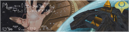
I like the Goa'uld siggeh... 8/10
Re: Rate the Signature above you.
Posted: Fri Apr 10, 2009 11:35 am
by Colton
Good: I like the cartoony effect with the ship and lower quality export, something unique ^_^
Flawless animation also
Bad: The world is a bit choppy around the edges >_<
7.5/10
Re: Rate the Signature above you.
Posted: Fri Apr 10, 2009 11:38 am
by Skunky 2.0
6.5/10
Re: Rate the Signature above you.
Posted: Fri Apr 10, 2009 11:44 am
by Awaken Knight
8.5/10
like the text and the placement of it on the sig, also the focal isn't too bad
Re: Rate the Signature above you.
Posted: Fri Apr 10, 2009 11:51 am
by Colton
No comments? lol

Good: A very nice name 'thingy'

The green effects are nice
Bad: Don't care much for the border, don't like how the top of his head seems to merge into the black border..
Don't really like where the green effects are placed, seems there's too much of a contrast between the realialism of the picture and the green effects..
6.5/10 - 7.5/10
Edit: You would post just before me wouldn't you
Re: Rate the Signature above you.
Posted: Fri Apr 10, 2009 11:57 am
by Colton

Good: All around very nice sig

Bad: Lacks a border on the bottom and part of the left side o_O
Rating: 8/10 - 9/10

Good: Looks nice
Bad: Too much "blank" space I think
Rating: 6.5/10 - 7.5/10
Re: Rate the Signature above you.
Posted: Fri Apr 10, 2009 12:17 pm
by andell
6/10