Rate my sigs ive recently made :P

A record of past signatures, avatars, and any other graphics.

Moderator: Market Mods

Anygood

Yes? (comment)
13
59%
no?(why not thats it your massed.. jks)
9
41%
 
Total votes: 22
User avatar
[SlayerS_fith]
Forum Elite
Posts: 1548
Joined: Sun Nov 05, 2006 2:11 am
Alliance: Ascended.Gen~
Race: ~Replicator
ID: 40009
Location: Aus

Rate my sigs ive recently made :P

Image

Image

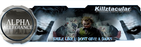
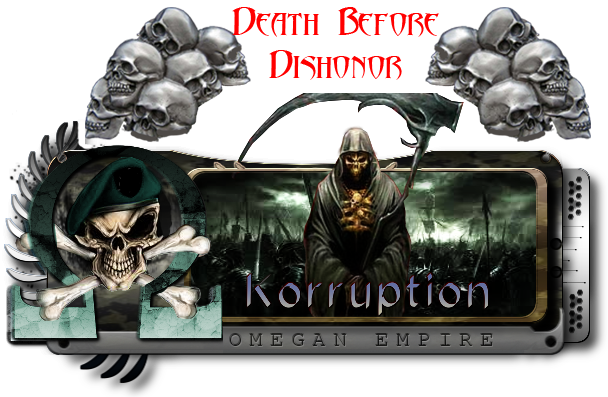
recently made after i took the effort to learn some photoshop tricks.
Spoiler
Image
Image
Image
Spoiler
Image
Song to My Carerr starting 2011 :P
http://www.youtube.com/watch?v=SPgfapFr3-s
User avatar
~Massin4Christ~
Forum Elder
Posts: 2266
Joined: Tue Mar 13, 2007 12:14 pm
Alliance: The Legion
Race: System Lord
ID: 0
Location: Stealing your naq from your base!

Re: Rate my sigs ive recently made :P

I might transfer to alpha just to get one of the sigs! :razz:
Image
Image
Spoiler
Image
J I X
Forum Irregular
Posts: 285
Joined: Fri Oct 23, 2009 6:04 pm
Alliance: Sigma
ID: 0
Location: scotland

Re: Rate my sigs ive recently made :P

i like the joker one
Image
Image
User avatar
Korruption
Forum Elite
Posts: 1580
Joined: Fri Apr 14, 2006 2:58 am
Alliance: Tombstone
Race: System Lord
ID: 1936624

Re: Rate my sigs ive recently made :P

they look good bro, i think you should make me one :) for all time sake :P
Image
Spoiler
Image
Image
Image
^^^ Skyfighter
Image
^^^ Phalax
{img]http://i181.photobucket.com/albums/x200 ... orr1-1.png[/img]
^^^ Korruption
TheAnimal
Forum Irregular
Posts: 332
Joined: Fri Apr 18, 2008 10:26 am
Alliance: Sigma allegiance
Race: Ancient

Re: Rate my sigs ive recently made :P

The one with the Joker was nice.

The transformers one I didn't like that much, the colors don't really fit in with the alpha tag and it looks a bit smudgy.
Image
User avatar
minisaiyan
Forum Addict
Posts: 2920
Joined: Sat Jul 08, 2006 5:00 am
Race: DieHard
Alternate name(s): CJL
Hatebreeder
Aesthetics of Hate
Location: At a concert headbanging

Re: Rate my sigs ive recently made :P

i voted no for the hallubit. but they are good. try to work on cleaning the borders up thoough mate ;)
Image
User avatar
Heru ur
Forum Regular
Posts: 520
Joined: Sat Oct 11, 2008 9:09 am
Alliance: ~RiCoS_WÅrLoRdS~
Race: System Lord
ID: 1946102
Location: Scotland

Re: Rate my sigs ive recently made :P

aye i think both are pretty nice.
Image
Neimenljivi
Forum Zombie
Posts: 6140
Joined: Sat Jun 17, 2006 12:23 am
Alliance: Lone wolf
Race: Slovenian
ID: 82089
Location: Slovenia

Re: Rate my sigs ive recently made :P

They're nice, especially like the Joker one. You should, however, watch out for sig cuts, because they're both cut on the left side of the sig and you can also see the borders where they end.
Image
Haz wrote:It took a bit of time, but the investigation has now been completed.
S1eepy will be banned for scripting, for the remainder of this era.
Name: S1eepy [ TheCheekyChickens ]
{Banned}
2012 Awards awarded to me:
Spoiler
Image
Image
User avatar
Juliette
Verified
The Queen
Posts: 31802
Joined: Sun Feb 06, 2005 6:57 pm
Race: Royalty
ID: 4323
Alternate name(s): Cersei Lannister
Location: Ultima Thule

Re: Rate my sigs ive recently made :P

I like them. And I like how you 'learned a few tricks' and came up with these. Learn a few more, and your amazingness will be unstoppable. :-D
Image
Reanimated
Forum Grunt
Posts: 93
Joined: Wed Jun 18, 2008 3:53 am
Race: Ancient
Location: Poprad...SloVaKia
Contact:

Re: Rate my sigs ive recently made :P

Voted no. Why?

1. This answer will make you want to improve
2. Id say they are somewhere between good and bad, but there was no such option
3. There is a potential - but its not used to its fullest capacity
4. Style is not original - you are good, but you need your own style to be even better. You should master more than one style, people demand various things (sigs, avatars, posters, banners, userbars, god knows what else...)
5. There are some basic rules that you followed and some that you didnt.
6. Other reasons that Im lazy to discuss :-D

Soooo, if you wanna get better - practice, practice...Ill vote yes when they are flawless, everything else is just average and thats why no good :P
If you want any help - PM me, we can work sth together (I like colabs :))
Dont take this like Im harsh, just wanna help ;)
Want a sig? Send me a PM
Image
^ Click to see my work ^
Image
User avatar
Legendary Apophis
Forum History
Posts: 13681
Joined: Tue Jun 14, 2005 12:54 pm
Alliance: Generations
Race: System Lord
ID: 7889
Alternate name(s): Apophis the Great
Location: Ha'TaK

Re: Rate my sigs ive recently made :P

I agree with Neim about the borders...otherwise, good job I would say. :)
Image
Image
Spoiler

Incarnate - LG - LG1 - LG2 - LG3 - LG4 - AG - EAG ~ AGoL - Completed
Spoiler
<Dmonix> Damnit Jim how come every conversation with you always ends up discussing something deep and meaningful?
<Dmonix> We always end up discussing male/female differences or politics or football
<Dmonix> All the really important issues in life
Empy
Derper
Posts: 7215
Joined: Sat Jun 07, 2008 7:02 pm
Race: Eldar
Location: The other side of the fence

Re: Rate my sigs ive recently made :P

Borders as already said. Text in the Joker siggeh isn't the best (I always found text the hardest part of the siggeh :shock:) other than that they look rather good :-D
Image

Image[url=steam://friends/add/76561198036220818]Image[/url]
Spoiler
Image
Image
Image
Image
Image
Awaken Knight
Forum Elite
Posts: 1642
Joined: Tue Mar 04, 2008 8:49 am
Alliance: MaYHeM
ID: 38569
Location: England

Re: Rate my sigs ive recently made :P

Reanimated wrote:Voted no. Why?

1. This answer will make you want to improve
2. Id say they are somewhere between good and bad, but there was no such option
3. There is a potential - but its not used to its fullest capacity
4. Style is not original - you are good, but you need your own style to be even better. You should master more than one style, people demand various things (sigs, avatars, posters, banners, userbars, god knows what else...)
5. There are some basic rules that you followed and some that you didnt.
6. Other reasons that Im lazy to discuss :-D

Soooo, if you wanna get better - practice, practice...Ill vote yes when they are flawless, everything else is just average and thats why no good :P
If you want any help - PM me, we can work sth together (I like colabs :))
Dont take this like Im harsh, just wanna help ;)


I have to agree with most of what is being said here, the best way to improve is to practice and practice even more, im not saying that there bad, but im also not saying there awesome, i think with enough time and effort being put into them, they could become very good.

And text isn't great, but i really shouldn't be complaining as i am still working on improving my texts.. and like reanimated suggested, try and find a style which you can improve on and master, this will improve you on making various types of sigs, avys and mostly what was posted :)
Image

Image
Spoiler
Image
Image
User avatar
[SlayerS_fith]
Forum Elite
Posts: 1548
Joined: Sun Nov 05, 2006 2:11 am
Alliance: Ascended.Gen~
Race: ~Replicator
ID: 40009
Location: Aus

Re: Rate my sigs ive recently made :P

Awesome yeah it took me about 2 hours to learn how to make the Vectors for the borders then after that i was like ahhhhh

then the joker one was one of 3 models i made. the others are interesting.
but yeah i gotta find myself new text's and brush's b4 i can begin to really up my ability's to make sigs :)
Spoiler
Image
Image
Image
Spoiler
Image
Song to My Carerr starting 2011 :P
http://www.youtube.com/watch?v=SPgfapFr3-s
User avatar
The Murkar
Forum Regular
Posts: 512
Joined: Thu Jul 09, 2009 2:59 pm
ID: 0
Alternate name(s): Capo

Re: Rate my sigs ive recently made :P

EDIT: I voted yes, by the way. :lol:

Reanimated wrote:Voted no. Why?

1. This answer will make you want to improve
2. Id say they are somewhere between good and bad, but there was no such option
3. There is a potential - but its not used to its fullest capacity
4. Style is not original - you are good, but you need your own style to be even better. You should master more than one style, people demand various things (sigs, avatars, posters, banners, userbars, god knows what else...)
5. There are some basic rules that you followed and some that you didnt.
6. Other reasons that Im lazy to discuss :-D

Soooo, if you wanna get better - practice, practice...Ill vote yes when they are flawless, everything else is just average and thats why no good :P
If you want any help - PM me, we can work sth together (I like colabs :))
Dont take this like Im harsh, just wanna help ;)


lol rules are for panzies mate :razz:

Just kidding mate. There are bits of this that I agree with and bits I don't. I agree that the style is unoriginal, but very few sig makers start making sigs using an original style. Master the commonly used styles before making your own. Also, I don't think there are rules; if there are rules, everybody follows a different set, unless what he's referring to by rules is the way designs should be or 'ought' to be carried out (the proper way) in which case #4 and #5 should be mutually exclusive.

I think they're good sigs, and you should continue to practice; you'll only get better. :D

If I can make two suggestions, though, I think these things are important:

1. [spoiler]When you resize images, you'll see a bar appear (depending on what program you use and what version) and you should see a box which says "constrain proportions;" always check the box, and always resize your images by dragging from the corner rather than oen of the four sides - this will prevent your images from stretching, the single biggest mistake sig makers make (but very easy to correct).[/spoiler]

2. [spoiler]Watch that when saving .PNGs you don't have pieces visible which aren't supposed to be there; on #1 there's a grey bar above the sig, and on #2 there is a line of black pixels along the left edge of the sig. An easy way to solve this: When you are working with your image, duplicate all of the layers and merge them into one layer on top of everything else, and then put all of your other layers in a folder and hide the folder. This way your work is all on one layer without losing any of your edits. Then, add a background layer underneath everything and fill it with a medium grey. You'll be able to see anything which shouldn't be there agaisnt the background (sometimes they're hard to spot because of the checkered background used for transparency) and can then select your merged layer and removed these things before saving. Also, just keep an eye that you aren't cutting off the edges of your sig, I saw a couple others mention this, just something to be aware of.[/spoiler]

Hope this doesn't sound harsh either, just trying to help you as best I can :D some very small improvements can make a big difference in terms of sig quality so keep that in mind haha (also, sorry, wrote you a novella here but I hope it's helpful despite the length).
M A N D O L I N
My sigs below are for sale if you want to pay (well) for a good sig.

Image

Image
Locked

Return to “Graphics Archives”