Hello actually i don't know if this is the right place to post my idea and i wanna excuse my bad english, because it's not my mother language and i'm still leraning it.
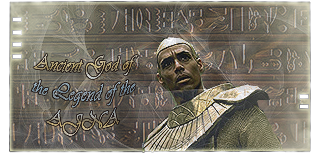
So now i come to my point, i think the Homepage doesn't look very good, actually i think it's discusting. These Pictures on the top haven't been chosen carefully, expecially the last picture with the asgard thor, you can count the pixels, that looks damn ugly, and it has been "skaliert" (don't know the english word for it so i try to descrpie what i mean), you made it bigger and didn't hold the proprtions.
Next i think, that wenn you log in, this bar at the top with the pictures should leave, they are iritating by playing.
I just started the game and i haven't seen much of it but i think it's very cool, so i hope you maybe change somehow the Homepage.
MFG Ancient Asgard
Design from the Homepage
-
Guest
-
Fox
- Forum Grunt
- Posts: 79
- Joined: Thu Feb 10, 2005 10:59 am
- ID: 0
- Contact:

-
Ancient Asgard
-
Ancient Asgard
btw dies navigation bar on the left, omg i don't know what i say about that, this frame for the background, kill it please, make a nice, one color Bar and it will look good and it will be effektive but this *Arg*
Next i want to say, chose ONE colour for the text and not 2 or more, this red colour at the Top it's bad, just bad, and don't underline the things, or when you have to, don't cross out think like you did with ever g, y and so on....
I just do these becaus i learn how to make a HP and what looks good, and actually i could take this site to show what you can do wrong by making an HP, so sry for the "attack on the HP" but i just want that the game goes forward and that it'll got a good look that brings new and more players to play
-
Cole

- Forum History
- Posts: 10000
- Joined: Thu Feb 24, 2005 10:45 am
- Alliance: Generations
- Race: System Lord
- ID: 7889
- Alternate name(s): Legendary Apophis, Apophis The Great, Legendary
Hmmm....
 I know, you're Asguard so you havent same pics than others because I dont see any pic of Thor so I understand what u say...
But for Goa'ulds, the pic is alright...
I dont know for others...
But for Goa'ulds, the pic is alright...
I dont know for others...


Spoiler
Recent descensions


Proud to be European!


Balthazor
Cole
Proud to be European!
Balthazor
Cole
Trade feedback
Taking this, and what was available at the time in Eagles Nest, a tribute of 2,646,700,740,469,084 Dark Matter Units was demanded, and taken,
-
andyconda
I have to agree, I think the images should leave(or get some beter ones). I use to be a web designer(I still do some) and I prefer a nice clean look.
This is my webpage. http://users.iglide.net/tonnesenteam/home.html
I'm not saying it should look anything like that, I just think the home page should be a lot simpler.
I'm not complaining, I am just trying to help. And I am willing to give it a shot if help is needed.
This is my webpage. http://users.iglide.net/tonnesenteam/home.html
I'm not saying it should look anything like that, I just think the home page should be a lot simpler.
I'm not complaining, I am just trying to help. And I am willing to give it a shot if help is needed.
-
Ancient Asgard

-
[SGC_ReplicÅtors]
- Forum Addict
- Posts: 3949
- Joined: Sun Mar 13, 2005 4:57 pm
- ID: 0
-
Lord_Core
- Fledgling Forumer
- Posts: 100
- Joined: Thu Feb 17, 2005 12:40 am
SGC_Replicators wrote:i think we need better pictures for the 4 races they seem bland the more i see them
Perhaps have a 4 pics that you rotate out of the diffrent races once a races has the most in the top 50 that races photo is up at the top right hand where you have sometimes
Hathors Tummy, Asguard, Gou'ld Snake. Have it for the bragging right of the race who has majority of the Galaxy in control. And gives more of a reason for attacking people of one race rather then whom ever has the most Naq. Though I'm sure the most Naq thing wont change nothing :p
-
Raconar
- Forum Grunt
- Posts: 74
- Joined: Wed Feb 23, 2005 3:06 pm
- ID: 0
- Location: Behind your armory with some C-4...oh, hi there...
- Contact:
-
Forum
- Site Admin
- Posts: 2844
- Joined: Sun Jan 30, 2005 1:52 pm
-
Honours and Awards
i'm open to anything that improves things....
but....
I do not want to use pictures of actors (copyright), i do not want individuals because if we have 10,000 players, do we really want to stereotype them into one picture (ok -so i've done it already with asgard, but hey - 3/4 ain't bad....)
I like simple and clean -- I also like fast loading for everyone who does not have high speed net.....
and any help I will take on page design ... feel free to take my html/pics, make it better, and let me see what you can do
(I am much better at math and stats than graphic design....)
admin.
but....
I do not want to use pictures of actors (copyright), i do not want individuals because if we have 10,000 players, do we really want to stereotype them into one picture (ok -so i've done it already with asgard, but hey - 3/4 ain't bad....)
I like simple and clean -- I also like fast loading for everyone who does not have high speed net.....
and any help I will take on page design
(I am much better at math and stats than graphic design....)
admin.

-
Raconar
- Forum Grunt
- Posts: 74
- Joined: Wed Feb 23, 2005 3:06 pm
- ID: 0
- Location: Behind your armory with some C-4...oh, hi there...
- Contact:
Very interesting...
I have never seen that pic in my travels through Stragate fan sites or anything else...I wonder what it is and why it linked to the replicators...